Badge: Technology Blogging

Screen capture of my lovely blog

I need to swear off blogging for like. Five years. I’m just about blogged out. That’s not just from doing this badge. It’s because blogging is hard. It’s hard,  hard work and it takes a lot of dedication to get the get-up-and-go every single day or even just every two days to find something brilliant to say. I know this from several years of experience. Before this blogging experience, I blogged for over a year and a half at HackCollege.com. I for about a year, I blogged once every week. But then we got paid for every post we wrote, and so then I was posting once a day for almost four or five months. It was a lot.

Anyways, so blogging takes a lot of work and sometimes it’s very tedious. You may know what you want to say, but it takes you an hour and a half to type it all up, to find the right words, to find the right pictures, to find the right links. It’s exhausting. It really is. I have so much respect for the professional bloggers because I don’t know how they did it.

When I did find the time and energy to blog, I had fun with it. My blog focused on alternate reality games (oh my god, what a shocker) and technology, which is of course always interesting to me. I was kind of surprised when I found that I had so much to say about ARGs. It shouldn’t be so surprising since I mean, I’ve only been researching them for the past three years basically. But it was very empowering to be like, “Hey, I know what I’m talking about, so much so that I am allowed to have opinions.”

Even if no one happens across my blog, I’m proud of the thoughts that I got to voice, even if just for the fact that I got them out of my head and onto the internet. I’m hoping that I’ll keep the blog casually updated through the summer when I have more free time. I still have more to say, so let’s hope it continues!

Link to my blog.

Badge: Wireframe Wizard

Wireframe for a graphic designer home page

Wireframes are like an outline for a website, and in that sense I feel like I would love them more than I do. I don’t dislike them. I just don’t love them. I find this very contradictory of me since I’m a very visual person and I love writing outlines before I launch into a paper. Apparently, I am just odd in this sense. Anyways, I did have fun with these particular wireframes. However I think that was because my client (mmhaha) wanted a minimalistic design. I think I don’t like wireframes because they really make me think about every single detail of a webpage before I launch into it. And in some ways, that’s a good thing. That’s what you’re supposed to do before an essay. But with a webpage, I like being able to sit there for several hours and play around with how things are really going to work instead of sitting with a wireframe and thinking “Okay now do I need a button there?”

But anyways, since I was working with a minimalistic design and a website that was more visual than interactive, the wireframes were pretty straightforward. I used Balsamiq for my wireframes. After reading some of the comments of the wireframe articles, it seemed to be very highly rated. I neither love nor hate Balsamiq. I like it better than the other wireframe software we were using, but I still just find it very confining. I think maybe that’s another reason I don’t like wireframes. I have to use their buttons and shapes, and I’d almost rather just draw it by hand, as terrible of an artist I am.

So anyways, that’s my experience with wireframes. I know they’re valuable in theory, but I’d rather tinker around with my site for several hours to get things how I’d like them. I can’t ever see what I want until I’m actually doing it. But maybe wireframes are more helpful when you’re working for a client. That way, you can show them the design you’re thinking about and show it to them so that they can tell you that they hate it before you actually spend hours making it. In that sense, I suppose wireframes are okay.

Here is a link to my strategic analysis.

Oh also, I discovered Bacon Ipsum. Yeah, it’s a real thing.

Badge: Frameworks

The idea of CSS frameworks is very simple. Your content is all separated vertically by a grid. This allows designers to organize and visualize along this grid to space and arrange their elements. It’s really quite genius and once I got the hang of it, I appreciated the simplicity of it. I opted to use the 960 grid system. In most of my projects now, 960 is pretty much my standard main content width. It just really seems to work. It’s wide enough to fill the page, but it’s narrow enough to not make you feel like the content is overwhelming. Anyways, within the 960, you can have a grid of either 12 or 16 columns. I like 12 columns, so that’s what I worked with. Each column is 60 pixels wide with a padding of 10px in between each column. You arrange things by designating how many columns it ought to take up. I’ll show you an example below.

Version one of my frameworks design.

As you can see, the pictures are arranged in three columns. So I told the coding, “Okay, I would like the picture to take up four columns.” I tell it that by putting it in a div id and then naming the class of that div “grid_4” — this tells it to take up four columns. I did the same for my other two pictures. If I told the third picture to take up 5 columns instead by saying grid_5, then it would have bumped down below the first picture because it wouldn’t have fit within the 960px. Everything has to add up to 960px.

When I did the columns, I put the text in their own div tags and called their class “grid_6” because I wanted them each to take up six columns. See? It’s really quite simple once you understand what the class names are telling each part to do.

This is a good way to organize material if you are in a rush and just need to get some stuff up there in a jiffy. I’m not 100% sure I will ever use CSS frameworks in the future, but I think it’s something really interesting to know how to do. I think it would be even better if they had something that arranged content both vertically and horizontally, but that’s probably more complicated since you can scroll down eternally on a webpage.

If anyone would like to learn frameworks, I used this tutorial video to teach myself.

Also below are the other versions of the content I arranged.

Version two of “Silver-Locks and the Three Bears”

And version 3

Badge: Domain Hosting UPDATE

This is what lauraschluckebier.com WILL look like after my domain hosting services duke it out.

UPDATE: HostGator finally came through for me! You can see my site completed over at lauraschluckebier.com!

UPDATE TWO: It only behaves in Chrome or Safari, and NOT in Firefox… I will need to fiddle with it to make it behave. So anyways, please view in Chrome.

Okay well my experience with this is just. It’s traumatic to say the least. I had already created a domain name for myself (lauraschluckebier.com, obviously) over winter break so that I could use it as an online portfolio for getting into grad school. I was very happy that I did that because it got me into graduate school (Georgia Tech, woot woot), but I am not very happy now that I have to transfer my domain name. It is a very long and frustrating process. Let me tell you what you must do in case you ever have to do it. I purchased my domain using the platform that I created my website, flavors.me. This is a really cute, really easy to use website. It’s really great to use if you have no web design experience. Of course, I do now, and I wanted to create my own designed website. So I wanted to disconnect my domain from my flavors.me page and attach it to a new account hosted at HostGator. In order to do so, I had to figure out if my domain even could be transferred. To do this, you have to do a whois search. Just Google whois and you’ll get a bunch of sites that will do it for you. I used tucowdomain’s search. Anyways, so then that told me that domain tranferring for my site was locked. So then I had to contact flavors.me because they purchased the site for me and ask them to unlock it. They very promptly helped me, unlocked my domain, and gave me a transfer authorization code. This code is really important because you give it to the new hosting service to prove that that site is yours and you have the authority to move it.

After I did this, I filled out a form on HostGator to request the domain be moved to their server. Apparently, I did it wrong the first time because they told me that it was rejected. (Can you see how big of a headache this is yet?) Anyways, after getting on the phone with HostGator’s customer service and asking for their help, they finally got me to the correct domain transfer form (there are two of them, and only one works apparently). They assure me that this will work, and that I should hear back from them within the week and that it will be working. After doing this, however, you also have to change the server that your website points to. This seems logical, but you have to know how to do it. I’m not sure if this works for everyone, but I logged in at https://manage.opensrs.net/ where you can change where your website points to. So finally my website stopped pointing to my flavors.me page and is now just pointing to a blank HostGator page.

I am still having a lot of difficulty using the HostGator control panel. I think it is the most confusing thing in the entire world. I can’t tell if the buttons are ads or if they’re options for me to use. I think I would much rather just use FileZilla to import my files because I cannot for the life of me figure out how to do it with the control panel. Of course I can’t do that yet because my domain name isn’t configured. Ugh. Such is the life. This whole business probably won’t be figured out until after this is due, but I do have a domain name and I do have a website. They’re just not exactly hooked together at the moment. So in a few weeks you can visit lauraschluckebier.com but in the mean time you can see what will be on that site here on the pages that I uploaded to the transmedia server.

Badge: Google Analytics

A screen shot of my overview.

I was particularly fortunate in this badge because I had enabled Google Analytics for my Honors Thesis project website where I had over 160 people visiting my website for a week-long period. Because of this, I have really excellent data to discuss and analyze.

What I really wanted to generate from using Google Analytics was mostly just basic quantitative data– how many people visited my site. However, as I started really using Google Analytics, I realized how much more awesome stuff I could report on and use in my project. The goal of my thesis was to create a game framework and show that it could be a successful promotional tool for future clients. Future clients are going to want to know what kind of buzz this game is creating, and I was able to measure that quite accurately with Google Analytics. For instance, I could see how many visits I had over a period of time– per month, per day, per week. I can see how many are unique users, which I think is really handy especially for someone like me who is constantly checking their work. I was afraid that just me checking on the status of my site would account for 50% of the traffic. I can also see on average how many pages people visited, how long they stayed on the website, which pages they looked at the most, and so much more. All of this information is absolutely invaluable not only to web designers but to people like me who need to use these statistics to prove a point and back up their theories.

What I learned about my users for this website is that they stayed on my website for a really long time– an average duration of 5 minutes and 41 seconds. That is awesome. This would be great news for advertisers who would want to advertise with my client– people would be more likely to see their ads. Additionally, I found that my website had a bounce rate of only 23.93% which is really good as well. According to this article, “As a rule of thumb, a 50 percent bounce rate is average. If you surpass 60 percent, you should be concerned. If you’re in excess of 80 percent, you’ve got a major problem.” With a bounce rate of less than half of average, my site is in pretty good shape.

Screen shot of content overview telling me what content people viewed most.

It was also worth noting that my users visited on average 4.93 pages during their visit. Again, this information is not only good for me as a web designer but to me as a salesperson. I can tell advertisers that they will want to hop on board with this project because visitors are likely to visit several pages on the site, not just the home page. Going along with this, I can tell which pages were the most popular. As I predicted, the pages displaying the clues and the leaderboards were the most popular. The clues page was even more popular than home page, which was interesting. Very view people actually visited the “About” page, which isn’t exactly surprising but it is kind of disappointing. This information would definitely be something that I take into account in the future. I would need make sure that any necessary information is located on the home page where people will be more likely to see it. The “About” page contained some very interesting information about the game and its background but did not contain vital information about the gameplay, which is what most people are interested in. That is important to note– the players of my game were interested in getting directly to the point. They wanted to solve the clues and see if they were winning. The page that contained the plot of the game only got 9% of total views, which is again interesting to me as a game designer– this tells me that the players were less interested in the actual story of the game and more interested in the individual clues.

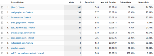
Another really interesting thing that I learned from Analytics is the source of where visitors are coming from. I just love this, I think it’s so great. I can see that 991 people came from a direct link, 240 came through a link I sent through email, and 123 came through Facebook. I didn’t even realize that people were coming through Facebook! I guess social networking does really work. Anyways, that’s really great information to have because I can show my clients where their visitors will be coming from and more importantly where they aren’t coming from. If more people should be coming from a certain source, then a web designer and the content designer can work together to come up with a better way to address this problem.

Screen shot of where my visitors were coming from.

One final thing that I really enjoyed looking at through Analytics was the Browser and OS of the users. This can be information that is just interesting or really useful. If I’m working for Windows v. Apple, I’d want to know what OS my participants are using. Additionally, this can be helpful to web designers to see if they need to change any aspects of the pages to fit with different browsers. 35.72% of users were using Safari (why is this so high??? Maybe due to iPhone use?), 33.82% were using Chrome (yeaaaah), 20.28% used Firefox, and 7.32% used Internet Explorer (for shame). And then OS: 43.79% (624 users) were using Windows, 32.70% were using Macs, 17.75% used an iPhone, 2.29% used an Android, 1.26% (18 users) used an iPod, 1.26% used Linux, and 0.84% (12 users) used an iPad.

Screen shot of user browser information.

Sheetshot of the OS of viewers. Very interesting.

I will definitely be using Google Analytics in my own personal website once I finally get the darn thing up and running.

Badge: Minimalist Design

I gotta say, I am a big fan of minimalist design. As soon as I started flipping through (read: looking on the internet) examples of minimalist design, especially from Simple Desktops and Minimal Movie Posters, I was hooked. I love that it’s simple yet elegant yet really quite sophisticated. Clearly it’s simple because of the lack of too much busyness going on, but really it’s sophisticated because it requires the viewer to do more work. Minimalism has got the gestalt thing going on– the whole is greater than the sum of its parts. Instead of seeing just some random shapes, which is what minimalist design is at its core, the viewer has to put them together in a meaningful way. For example, insead of just seeing some random shapes in this desktop, the viewer clearly puts together the little circles and wavy shape to be John Lennon’s face. I think that’s why minimalist movie posters are SO awesome. Only people who know the movie and truly appreciate the movie can understand the awesomeness of some of the posters. I mean think about this one for the movie The Prestige. You wouldn’t understand it if you hadn’t seen the movie. But for fans of the movie, we see it and we think, “Wow, that is so awesome.” I think this is because doing minimalistic work really requires you to just cut to the core of whatever it is you’re dealing with. What is the core, and there you will find your design inspiration.

Movie posters aside, minimalist design in web pages have some easy-to-employ trends. The most common ones that I saw in my browsing through minimalist design articles were:

  • Use of white space
  • Use of grey with accent colors (I think this is my favorite minimalist trend)
  • Use of abstract shapes rather than photos
  • Use of core themes to convey an entire meaning
  • Use of circles

So with these things in mind, I decided to set off and try my hand at minimalism. I really had a lot of fun with this. I knew that in order to do this, I needed to conquer the pen tool, so I did that badge first. With the pen tool mastered, I set out to draw silhouettes of shapes so that I could get that “shape” instead of photograph feel for my design. One of my favorite movies of all times is Willy Wonka and the Chocolate Factory (the older version, thank you very much– I do not appreciate Burton and Depp’s adaptation at all), and so I decided I would capture this film’s essence in a wallpaper background. You can see the result below.

My lovely background for Willy Wonka and the Chocolate Factory.

As you can see, I used the pen tool to silhouette this picture of Wonka. For only having used the pen tool for less than a week, this turned out really well. I’m particularly fond of the hat. The bow tie is a bit of a mess because, well, it’s a bow. But I think with it in the context of the signature purple blazer and that top hat, it comes together. Also, I added another minimalist touch– text in a floating position surrounded by lots of white space. That is my absolute favorite quote from the movie and possibly from any movie (yes, it originally from Arthur O’Shaughnessy, but I like it in Willy Wonka). I’m quite pleased with the outcome. It makes me happy.

After I tackled the wallpaper, I decided I ought to try a web page. Originally, I planned to just mock it up in photoshop, but then I decided that I wanted to use the design in my own web page that is forthcoming (see future badges!), so I just went a head and coded it as a web page. It’s not up or fully functional yet, but I have the Home and About pages coded and designed. Below is a screen shot of the home page.

A screen capture of the minimalist web design I created for my website.

I’m really pleased with how this turned out, which is good because it took me forever to get it exactly how I wanted it to look. I really have no idea how exactly the text box idea came to me. I think it was an idea I got in the shower. That’s the best place to think of ideas. Anyways, you can see that I used lots of white space. I also didn’t totally center the elements, which is another thing I noticed in some minimalist designs. I also used the minimalist favorite grey on white with an accent color of purple. And this time instead of using a graphic to cut to the core of the theme (me), I used text in a graphicy kind of way. It took a lot of patience and two Fringe episodes to position and size the words all correctly. Each of the terms shows something about me. I really like it. It’s serious but playful at the same time. Look for the completed version of this site within the next couple days.

Sources Consulted:

Simple Desktops

Minimal Movie Posters

Pallen, Neeru. (2012) “Essential principles for creating minimalist web design,” Design Modo. 1 February.

Chapman, Cameron. (2010) “Principles of minimalist web design, with examples,” Smashing Magazine. 13 May.

Gube, Jacob. (2009) “40 beautiful examples of minimalism in web design,” Six Revisions. 24 May.

Badge: The Pen Tool

It’s been said that most people either really love the pen tool or really hate it. I think that I am both. When then pen tool is doing what I want it to do, I love it. As I went through the Lynda tutorial and was outlining the magazine, I stepped back to admire my work and looked at my outline of my magazine and I was just like, “Wow, this is awesome!” My magazine curved, and I got the outline to curve perfectly along the page. It was a beautiful moment.

Lookit! It's beautiful! (Also I used different images because I couldn't get the tutorial files to download onto my computer. Sigh)

And then I got bored of that tutorial and I tried the penguin tutorial, and when I tried to trace the penguin, I almost threw my computer across the room. All that I had learned seemed to have just fallen out of my brain. So I both love and hate the pen tool.

I have ambivalent feelings towards the Lynda.com tutorial because I felt like after the magazine outlining of the tutorial, the guide started every section by saying, “Now we’re not really going to use the pen tool for this section.” I was just like, “Then why am I doing this.” That being said, I thought the way that he cut out the lightbulb was pretty nifty, by using different shapes. But then also, why not just use the pen tool to do that? We went through a LOT of trouble to make weird shapes and to get them to be perfect, and I just felt like we kind of could have done that with the pen tool since it does allow you to curve. I didn’t get that.

But I did do a lightbulb (again, a different one than he did) and it turned out prettyyyyy cool!

Pretty lightbulb!

I mean, okay it’s definitely not perfect, but hey, it’s pretty good.

Then I did the silhouette task. I think this was my favorite tasks to do. I’m not sure why, but it just was. It was just fun to make a silhouette.  I’d always wondered how to do that.

Before my awesome pen tool-ness

After my pen tool awesomeness

Plus, I really liked learning this because I realized that I could do so many other cool drawings with this. Like for minimalist stuff, I could find something I liked and then I could trace it to be like a cartoon or something. I have an idea for this, but we’ll see if it works. Stay tuned for my minimalist design update.

And then the final task was inserting myself into a magazine cover. Obviously, I would want to be on the Person of the Year cover sooooo:

Awkwardness all around. My hair looks super weird, but the Lynda tutorial guy did say that the pen tool wasn’t very well suited for hair. So there you go.

Badge: Heuristic Analysis

This badge required me to do some observation and analysis of my own on current web design. First I read many articles that had constructed their own checklists for “good” web design principles. These articles covered topics from working links to custom 404 pages. It was extremely interesting to see what different people valued in good web design. Some checklists were more concerned with the nitpicky details of the site, while others were mainly just concerned that it functioned. After reading through a variety of lists, I made my own list based off of the main categories that I observed:

  • Layout
  • Navigation
  • Design
  • Multimedia
  • Functionality
  • Information accessibility
  • Content

I looked at three websites to examine the way that they organized and designed their website. The three websites I looked at were HackCollege.com (a website for which I used to write), stars.nhl.com (because I am huge Dallas Stars fan), and pbs.org (because I have become recently obsessed with Downton Abbey).

One problem that I noticed in all of the sites was the bulkiness or clumsiness of the navigation. The navigation should one of the clearest parts of the entire sites, but I’ve found that many sites have very difficult to use navigation bars that make it really hard to get around the site. Some sites even have multiple navigation bars.

From doing this analysis, I learned the importance of looking at each piece of a website as an individual element and asking myself how could I make this part better so that the site as a whole could be better. Sometimes it’s hard to figure out what exactly is going wrong on a website until you break it down to its essential parts. Using a checklist to understand this helps designers to look at each element individually so that a site can come together with only the best parts.

Here is a link to my analysis.

Minisite 3: JavaScript Meets the Ministry of Magic

A screenshot of the "compilation" page from my minisite.

Well, so JavaScript is. Fun. I think it is both the most rewarding and absolutely frustrating thing that I’ve worked on so far. After hours and hours of trying to make one little thing work, when it finally does, there’s just this enormous sense of victory and accomplishment. I think this is more so than working exclusively with CSS or HTML because JavaScript is interactive, so you can see your work interacting with the user. It’s so rewarding to see your stuff actually working. Even if it’s just a little alert popping up, knowing that the stuff behind all of the layers is working is just. It’s wonderful.

With that being said, I also want to say that about 90% of the time, I wanted to reach into the computer and just smack JavaScript around a bit.

Okay, so as you can see, I based my sites not off exactly anything that necessarily exists but rather the world of Rowling’s Harry Potter. I got this idea when I was attempting to determine what kind of site would take down my information. I was feeling rather uninspired by my Scroogle site, so I tried having fun with this information-gathering-page. And then a funny thought appeared in my head of the Ministry of Magic using online forms to collect data. Since it was about Harry Potter, obviously I decided to run with it, since it is apparently my thing to mix my obsessions with web design assignments (see my ARG project for my last minisite). Anyways, having a theme and something that I was interested in made doing this a lot more fun. I was able to customize it a lot more and add in some fun quirks.

The part that I had the most fun with was doing stuff in Photoshop since I got to play with fonts and make banners and add Harry Potter swag to it. I think my favorite page might be the Diagon Alley page just because it’s so. Awesome. I’m so proud of my little banner logo. It totally looks like a mock  up of Amazon and the fact that I got to make a magical equivalent to it in the form of Diagon Alley just makes me happy. I also am rather pleased with all of my individual page menu buttons. They turned out quite splendidly if I do say so myself.
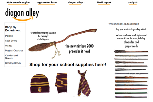
Screenshot of my Diagon Alley/Amazon page

There were some things that obviously gave me quite a bit of trouble. Figuring out how to put the images in the Diagon Alley page was a pain just because I only kind of sort of knew how to do it. But with the help of the wonderful Aly Miller, I figured it out, and I’m quite pleased with how it turned out. My problem was that I had it set to search for if localStorage.hogwartsHouse was equal to “gryffindor” and not “Gryffindor.” Those darn capital letters really got me, and I was a bit frustrated that something as simple as capital letters could mess up the entire function of the JavaScript.

The intrusive JavaScript element that I decided to add that we didn’t talk about in class was a function that checks to see if a user’s password is acceptable to the website’s standards. It seems pretty useful and it works pretty well. Plus the way that the text inputs into the box is actually the little circles and not actual text, so that’s pretty cool. I edited the script a little bit because an 8 character password, which is what it originally was, is super annoying. But the function checks if it has at least one lower case and one upper case character plus a number. I got the code from this little website by literally just Googling “things you can do with javascript.” When I was searching other terms to find other things I could add with JavaScript, the results came back with super complex things that I couldn’t even begin to wrap my head around. Initially, I really wanted to add some location-based JavaScript or Geolocation, but I couldn’t find a code that I could understand or get to work, so I found something else. I modified the code, as I said, both to add more characters in the password and so that it functioned in my external JavaScript page and not just as a script element in my HTML page, which is how it was originally set up. It worked as an internal element in the HTML, but I really wanted to keep all my JavaScript in the same place. It was much neater that way.

Another problem I ran into was a bit odd, and I’m still not even exactly sure what it was. But what I really, really wanted to do for the full report page was to have a banner appear declaring what priority each individual was, because the Ministry would totally do that. It seemed so easy because I had done basically the exact same thing with the Diagon Alley page– check to see what some variable was in localStorage and then put up a picture depending on what it was. Totally simple. But for some reason, it just would not work. I was so frustrated. I copied and pasted the code exactly in separate documents, I stripped it down to the bare essentials and worked up from there, and still it just would not cooperate. The thing that kept happening was that the JavaScript only seemed to run after I refreshed the page. So I would type in the stuff in the registration page, go to the report page, and the correct text would be there, but the wrong priority banner would be there. However, when I refreshed the page, it would work. I was so frustrated because it was working… but not quite.

Finally I figured out the two things that were making this happen. Firstly, I kept hitting the back button on the browser to go back to the registration page instead of clicking the menu choice which reloaded the page completely. That was somehow messing up the travel of information and what was stored in the localStorage variables. The other thing was that I was constantly checking and adding in new options to see if they were working. The thing that I realized is that once I added something new in the JavaScript, I needed to refresh the compilation page to let it “absorb” this new information. In my mind, I was letting it get used to this new information. So I found that once I changed anything in the JavaScript, I needed to go visit the other pages of the site to make sure that that JavaScript was fully in place in that page. Then when I would start with the registration page, it would work perfectly. So essentially I needed to be more patient between my various changes in my script and let the pages “absorb” what was going on. That’s not exactly what was going on, I’m sure, but that’s how I understood it.

Anyways, I finally got it all to be working. And my favorite part is that the priority banners pop up based on Harry Potter logic. If you type in Harry Potter, your priority level automatically pops up as high, since even though he’s half blood (or pureblood?? I’m not sure how Lily’s blood plays into this since she’s a muggle-born but a witch. Does her blood become magical? That’s a Potter debate for another time), which would make him medium priority, his name bumps him up to high priority. Additionally, I made non-human ancestors bump up an individual to high priority status (since the Ministry and Dolores Umbridge just won’t tolerate that) even if the person is half or pure blood (eg. Hagrid or Fleur).

Minisite Two: ARGs and Tech

Lookit this beautiful thing.

For such a seemingly simple website, coding this minisite took a lot of time. I think the hardest part of this assignment was finding a navigation bar that I was satisfied with. I did a lot of research and ended up taking bits and pieces from several different tutorials to create my own navigation that I was satisfied. The first one that I had originally coded used the ID tag and I did get it to function but I didn’t like the way it looked and it had the annoying habit of having the child elements being tabbed over so if your mouse didn’t follow the line exactly, the element would “unhover” and it would disappear.

I used this ALA article, which I ended up not using because I was really set on having a horizontal dropdown. I worked for far too long to try to make that work. I also looked at this one, and tried combining elements of this one to make it look how I wanted it to, but the result that I got was… Well, I didn’t like it. It was usable but I found it quite unsatisfactory. In the end, I used this tutorial and just modified it to look pretty. I am actually extremely satisfied with the navigation I have now, not only because I think it functions very well and is clean-cut, but also because I actually understand what the heck it’s saying. All in all, getting the navigation bar to work was definitely the most time-consuming and most frustrating part of the whole coding process. I was looking at code that I didn’t know what it did and when I thought I was doing something correctly, everything fell apart.

Also in this minisite I finally figured out how to center div tags. Yay!  Mostly what I wanted to center was the navigation toolbar because I thought it looked funny just by itself over on the right or the left with the body centered on the page. I put the navigation in its own div tag and then wrapped that in a wrapper2 tag. Essentially, what I was missing was setting a width for each div tags. Once you set the width, then I was able to center it by setting the margins to auto. The headers I centered by just aligning the text center.

When we were talking in class on Monday, I decided I ought to try my hand at multiple columns. I thought I had it all squared away and that it looked beautiful until I tried to highlight the page. For some reason the second column was highlighting after the third column. Then I realized that the way I had coded the page, my text went, visually, from the first column, to the third to the second. Well. That was weird. I played around with it for a bit and then just figured out that I had to float the first two columns left and then only the third one right. That solved the problem.

I didn’t have too much problem with the pullquote, and I thought it makes the page look pretty nifty. The only problem I really had with it was that I was editing one CSS page (ugh I know, originally I had a CSS page for each template, one for the analysis and one for the excerpt; I remedied that) and when I was refreshing the other page to see if it was working, I was refreshing for a different CSS page and so even though I was making changes to the CSS page, they weren’t showing because the page was linked to my other CSS page. It was really frustrating to be making changes and knowing that something should be happening and the pullquote would resolutely just be sitting there. That went on for a good 45 minutes. So, lesson learned: one CSS page.

Everything else I feel like there were just normal trial and error problems. I’m pretty pleased with the final result!

Oh also, I decided to throw in first person in my analysis of Why So Serious because I thought it added veracity to the statement that that game had more exposure than The Beast since that is a sentiment that I have come across in my research. Since I’ve been researching ARGs for the past six months, I’d say I’m entitled to make that statement and therefore use first person.

Wireframe for my excerpt template. You can see here that I still planned on doing two columns even though I eventually changed it to three.

Wireframe for the analysis template of my minisite. I forgot the footer section. Rats.